
What Is a Matcha Filter and How to Add It to Photos
A matcha filter is a creamy green color grade—dusty tea tones, latte-colored highlights, and soft contrast—not a neon overlay dumped on the whole frame. If you want that café / wellness look without Lightroom presets, ROCKIMG’s free Matcha Filter runs in the browser: five looks—including the viral molten-chartreuse Trend—an intensity slider, and a JPG download. Nothing is uploaded.
Published on: August 11, 2026
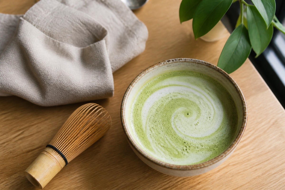
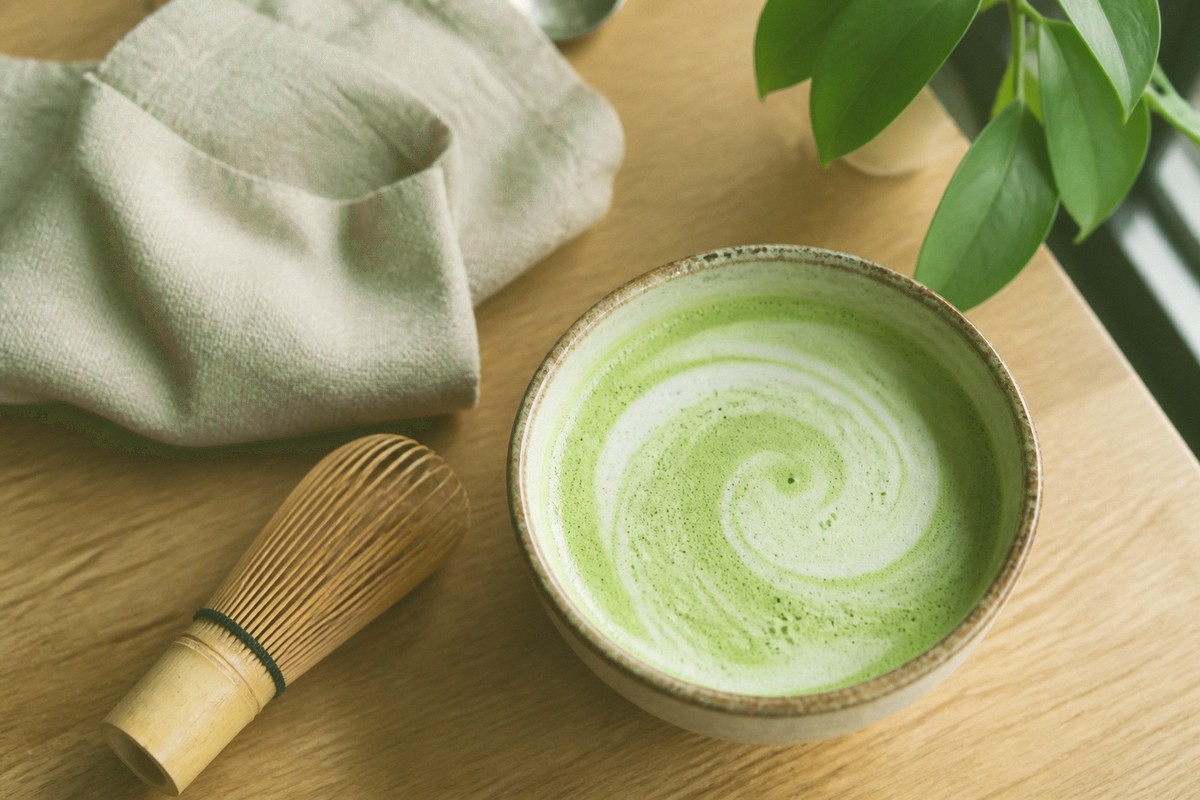
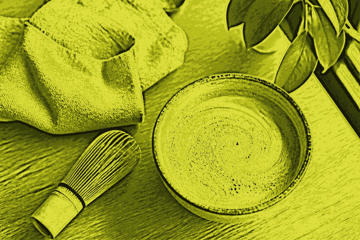
Want the look on your own photo?
Open the Matcha FilterWhat is a matcha filter?
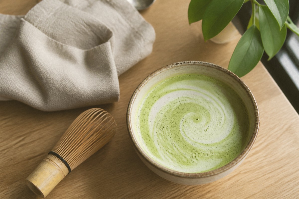
A matcha filter is a photo color grade inspired by powdered green tea and matcha lattes: muted yellow-greens, beige foam highlights, and slightly lifted shadows. It is closer to a Lightroom “Matcha” preset than to a cartoon green wash.
On social apps you will see names like Soft Matcha Vintage, Iced Matcha, or Grainy Hojicha. They share one idea. Greens stay earthy. Whites go creamy, not icy blue. Reds and magentas calm down so the frame feels like ceramics, linen, and slow café light—not a sports broadcast.
ROCKIMG’s Matcha Filter bakes that grade into one pass: a matcha overlay, cream lift in the highlights, olive in the shadows, a small hue nudge toward tea-green, and optional grain. The Trend preset goes further—it remaps brightness into a chartreuse-and-olive ramp with a solarized sheen, the “molten matcha” effect all over short-video feeds. You pick a preset, set intensity, then hit Create.
What colors actually make the matcha look?
The signature palette is dusty matcha green plus cream, not mint neon or forest teal. Highlights drift toward latte foam; shadows pick up olive instead of pure black.
- Midtones: ceremonial powder greens around olive-chartreuse, closer to whisked tea than to grass.
- Highlights: warm off-white, like steamed milk and ceramic glaze.
- Shadows: brown-olive, especially in the Hojicha look.
- Skin and wood: less magenta, a little warmth, so faces do not turn radioactive green.
- Blues: desaturated, so sky and denim do not fight the tea grade.
If a “green filter” turns your photo into slime, it missed the latte half of the look. Matcha grading is as much beige as it is green.
Why people search for a matcha photo filter
Creators use it to make feeds feel calm, edible, and consistent—cafés, skincare, plants, and indoor lifestyle shots. It is a mood, not a gimmick overlay.
- Café and food posts: bowls, foam, wood tables, and pastry already sit in that color family; the filter tightens the story.
- Wellness and skincare: creamy greens read “clean” without the icy clinic look of a cool white balance.
- Indoor portraits: window light plus a Latte preset can soften contrast that phone cameras punch too hard.
- Feed consistency: one grade across a week of photos beats mixing random Instagram effects.
- Private edits: ROCKIMG processes locally, which matters if you are grading client or personal photos.
It is a poor match for neon night scenes and high-saturation product shots that need accurate brand reds. Keep those closer to the original, or use a general tool like Image Filters instead.
How to add a matcha filter to a photo online
Upload, pick Trend / Classic / Iced / Latte / Hojicha, set intensity, click Create, then download a JPG. The whole path lives on matcha-filter.html—no account, no install.
Step 1: Upload your image
Drag a file onto the drop zone or click to choose one. JPG, PNG, WebP, and GIF stills work. Photos with some highlight room—window light, foam, pale walls—take the cream lift better than muddy, underexposed frames.
Step 2: Pick a look
Five buttons sit under the preview:
- Trend: the viral molten chartreuse look—bright yellow-green highlights, deep olive shadows, and a metallic sheen. The default, and the one you have seen on TikTok.
- Classic: balanced ceremonial green and cream. Start here for a subtle café grade.
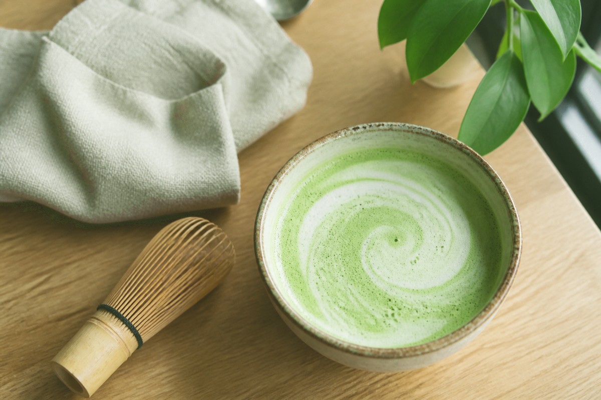
- Iced: brighter, mintier, cooler foam. Good for daylight and plants.
- Latte: extra cream, softer contrast. Kind to indoor portraits.
- Hojicha: roasted olive and warmth. Feels more autumn than spring.
Step 3: Set Intensity
The Intensity slider (20–100) blends the grade with the original. Around 70 keeps texture. Push it higher when you want a full café wash. Drop it if skin or product color starts to drift.
Step 4: Create and review
Click Create. The result panel shows the graded photo. If Classic feels too tea-green, try Latte. If it feels too beige, try Iced. Large images are resized to a practical size before filtering so the browser stays responsive.
Step 5: Download
Click Download for a JPG named after your original file plus a -matcha-filter suffix—upload photo.png and you get photo-matcha-filter.jpg. Keep the original file; this look is easier to add than to undo.
Tip: Change one thing at a time. Lock a preset first, then nudge intensity. Switching presets and the slider together makes it hard to tell what actually helped.
Which preset should you use?
Trend is the loud, viral one; Classic is the everyday café grade. Iced for daylight mint, Latte for creamy portraits, Hojicha when you want roasted warmth instead of fresh tea.
Trend — the short-video effect: portraits, streetwear, and paparazzi-style shots turn molten chartreuse with olive shadows.
Classic — everyday still lifes, tables, and mixed indoor shots.
Iced — plants, glass, bright kitchens, anything that should stay fresh.
Latte — faces, linen, and soft window light when contrast feels harsh.
Hojicha — wood, ceramics, evening indoor color, and “toasted” mood boards.
More preset examples
Same source photo, two other grades. Watch how Iced lifts the mint and Hojicha pulls the table toward roasted olive.
Matcha filter vs other green looks
Matcha grading is creamy and desaturated. A thermal filter, a jungle LUT, or a straight green tint will not land the same café mood.
A thermal or false-color map turns heat into neon bands. A “forest” preset cranks leaf greens and often cools the shadows. Instagram’s random green effects sometimes crush reds until skin looks sick. Matcha keeps reds quieter but still human, then spends the extra color budget on foam-colored highlights.
If you already shot in a green room, Classic can stack too much tea on tea—drop intensity or use Latte. If the file is a night city shot with cyan lights, Hojicha will not turn it into a café; it will only muddy the neon. Shoot or pick source photos that already live near wood, ceramic, plants, or daylight interiors, then let the filter finish the job.
Tips for a believable matcha grade
Start with a well-lit photo, keep intensity short of a full green cast, and match the preset to the scene. That beats maxing every control.
- Window light and pale backgrounds give the cream highlights somewhere to land.
- Food, plants, ceramics, and indoor portraits usually sit closer to the palette than neon street photos.
- Trend replaces the photo’s colors entirely, so it works on almost anything—but higher intensity adds contrast, banding, and grain. Ease toward 50 for a smoother sheen.
- If skin looks too green, drop intensity or switch to Latte.
- If the photo feels gray, Classic or Iced will hold more tea color than Latte.
- Hojicha plus a warm room already in the file can go muddy—ease intensity down.
- Want a 2000s digicam vibe instead of café greens? Use the CCD Style Filter for grain, flash bloom, and yellow cast.
- Need a different effect family (invert, blur, artistic stacks)? Open Image Filters.
Grade a photo with creamy matcha greens—free, in your browser.
Open the Matcha Filter