
How to Add a Grid to an Image Online
A photo grid is a set of even rows and columns drawn on top of a picture so you can line things up, check composition, or hand a layout to someone else. ROCKIMG’s free Add Grid to Image tool does that in the browser: set the cell count, pick solid, dashed, or dotted lines, optionally stamp A1-style labels, then download a PNG or JPG. The file never leaves your device.
Published on: September 25, 2026

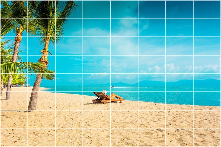
Draw a custom grid on your own photo—free, in your browser.
Open Add Grid to ImageWhy put a grid on a photo?
A grid turns a loose picture into a measurable layout. Equal cells make it obvious when a subject sits off-center, when a horizon is tilted, or when two elements should share the same column.
People reach for one in a few recurring jobs:
- Composition checks — a 3×3 overlay is the usual rule-of-thirds test before you crop or post.
- Design handoff — a mockup with labeled cells tells a developer which tile holds the logo, the price, or the button.
- Crafts and drawing — painters, embroiderers, and mosaic makers copy a photo square by square.
- Print and product shots — a light grid shows whether a package, poster, or UI screenshot is aligned.
- Teaching — numbered cells let you say “look at C3” instead of “the chair, a bit left of center.”
Desktop apps can draw guides, but those guides often disappear on export. This tool bakes the lines into the pixels, so the grid survives email, chat, and print.
What Add Grid to Image actually draws
The tool divides the full image into equal cells and paints lines between them. It does not crop, stretch, or resample the photo. The download keeps the original pixel width and height.
On add-grid-to-image.html the controls sit under the preview:
- Rows and Columns — each runs from 2 to 40. The default is 8×8.
- Line thickness — 1px to 20px.
- Line opacity — 1% to 100%. Lower values let the photo show through.
- Grid color — a color picker plus a few presets.
- Line style — Solid, Dashed, or Dotted.
- Draw outer border — a frame around the whole image, using the same style.
- Show grid labels — A1, B2, and so on. Columns are letters, rows are numbers, starting at the top left.
Labels have their own color, font size (about 12px to 64px, with a free number field), and position: top left, top right, bottom left, bottom right, or center. Past column Z the letters continue the spreadsheet way (AA, AB). The preview updates as you move a slider, and the export is drawn at full resolution, not at the size of the on-screen preview.
How to add a grid to an image
Upload, set rows and columns, style the lines, turn labels on if you need them, then download PNG or JPG. The whole path is on the Add Grid to Image page.
Step 1: Upload the photo
Open the tool and drop a file on the upload zone, or click the zone and browse. JPG, PNG, WebP, and GIF stills all load. Use the file you will actually publish or print. A tiny social preview will not match a full-resolution source if you later measure the cells by eye.
Step 2: Set rows and columns
Drag Rows and Columns. The preview redraws immediately. A 3×3 grid is enough for composition. An 8×8 or 10×10 grid is better when you are copying a drawing or planning tiles. Anything near 40×40 is a fine mesh; keep the lines thin or they will swallow the picture.
Step 3: Style the lines
Pick Solid, Dashed, or Dotted, then set thickness, opacity, and color. White or pale lines work on dark water and foliage. Black or navy works on sand, paper, and light UI screenshots. Opacity around 30–50% is a guide you can still see through. Push it higher when the grid itself is the point, such as a craft template.
Leave Draw outer border on when the grid should read as a finished frame. Turn it off when you only want the internal divisions, which is common for a rule-of-thirds check.
Step 4: Add cell labels if someone else has to find a square
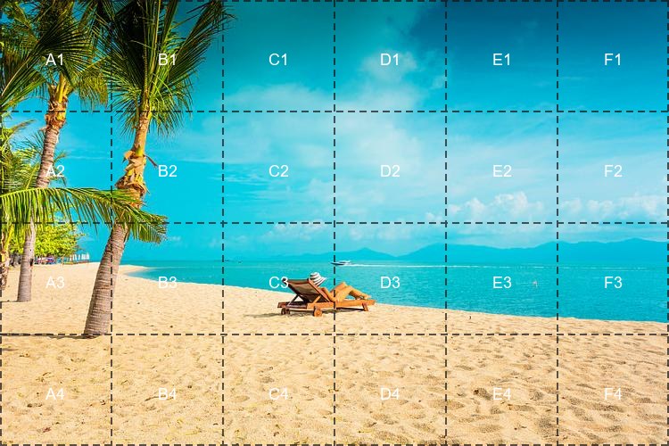
Turn on Show grid labels (A1, B2, etc.). The first cell, top left, is A1. The cell to its right is B1. The cell under A1 is A2. That matches spreadsheet order, so most people already know how to read it.
Then set three things that are easy to miss:
- Label color — independent of the line color. White type on a bright sky disappears; switch it to a dark color, or the reverse on a pale background.
- Label font size — presets at 12, 16, 24, 32, 48, and 64, or type a size. On a 4×6 grid, something near 16–24px stays inside the cell. On an 8×8 grid, drop toward 12px.
- Label position — center is the default and the easiest to scan. Corner positions keep the middle of each cell clear when the subject sits there.
Step 5: Download PNG or JPG
There is no separate Create step. Once a photo is loaded, Download PNG and Download JPG are ready. PNG keeps sharp lines and is the better choice if you will edit again. JPG is smaller and fine for a reference you will only look at. Default filenames are image-with-grid.png and image-with-grid.jpg.
Tip: Change one control at a time. Lock the row and column counts first, then the line style, then the labels. Moving all of them together makes it hard to see which change actually helped.
Which settings match the job?
Match the cell count to the decision you are making. A composition check wants few, light lines. A copy grid wants more cells and labels you can read at arm’s length.
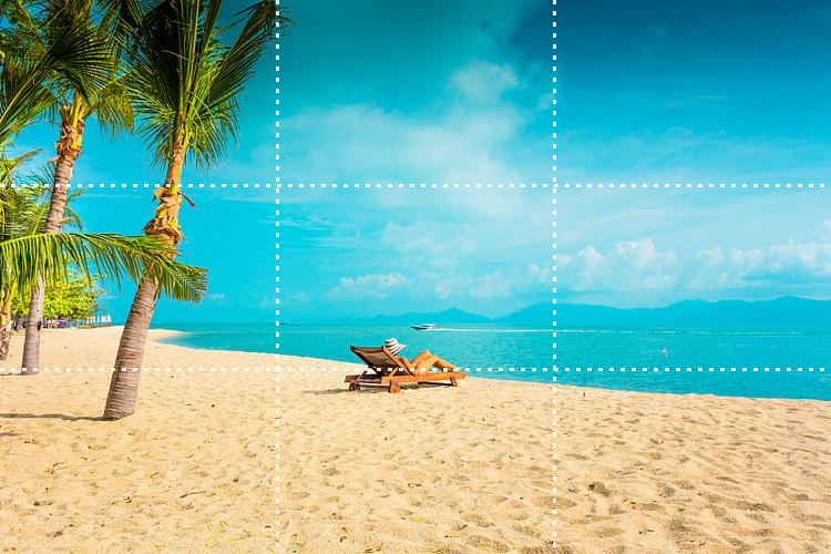
Rule of thirds: 3 rows, 3 columns, dotted or thin solid lines, opacity near 40%, outer border off. Place the subject near an intersection, not in the dead center, if that is the look you want.
Drawing or craft copy: 8×8 up to about 16×16, solid lines, higher opacity, labels on, font size small enough to fit. Say “copy square B4” instead of describing a region.
UI or poster alignment: columns that match your layout (often 4, 6, or 12), dashed lines so they do not look like part of the design, labels only if you are writing notes for someone else.
Teaching a photo: fewer cells (4×6 is plenty), dashed lines, white or black labels with a size around 18px, centered. The beach example above is that setup.
A grid overlay is not the same as splitting or annotating
Add Grid to Image paints guides on one picture and gives that picture back. It does not cut the file into tiles, and it does not add arrows or sentences.
- Add Grid to Image — equal cells, line style, optional A1 labels, one PNG or JPG.
- Image Splitter — after you have planned the slices, cut the picture into separate tiles.
- Annotate Image — arrows, shapes, and custom text when a cell name is not enough and you need a callout.
A practical order: grid the photo, agree on the cells, then split or annotate only if the next step needs separate files or written notes. Drawing the grid first keeps those later marks tied to the same divisions.
Tips so the grid stays readable
Contrast and cell size matter more than a perfect default. If you cannot see the lines on the subject, the overlay failed even if the math is even.
- On busy photos, use dashed or dotted lines. Solid lines fight texture in sand, leaves, and fabric.
- If labels collide with a face or a product, move them to a corner or shrink the font before you delete them.
- Thickness of 1–2px is enough on screen. Go thicker only when the file will be printed small or viewed on a phone.
- Opacity under about 25% vanishes on bright skies. Opacity at 100% can look like a window pane. The useful middle is often 35–70%.
- The export matches the source dimensions. A 4000px-wide photo stays 4000px wide, grid included.
- Processing stays in the browser. Refreshing the page clears the session, so download before you close the tab.
- GIF uploads are treated as a still. If you need a frame from an animation first, pause that GIF and save a PNG, then grid the still.
You do not need a layout app to add a grid to an image online. Set the cell count, pick a line style the photo can tolerate, label the squares only when someone else has to find them, and download. The beach samples above are the same file with three different settings: a plain 8×8, a labeled 4×6, and a light 3×3.
Upload a photo and draw the grid in the browser.
Open Add Grid to Image